Designing for smartphones, tablets and desktop: Responsive Design is the solution!

The last years have born witness to an explosion of internet-enabled mobile devices. Smartphones and tablets are progressively expanding their market share, and forecasts indicate that in the next two years mobile internet access will surpass desktop and laptop computers combined.
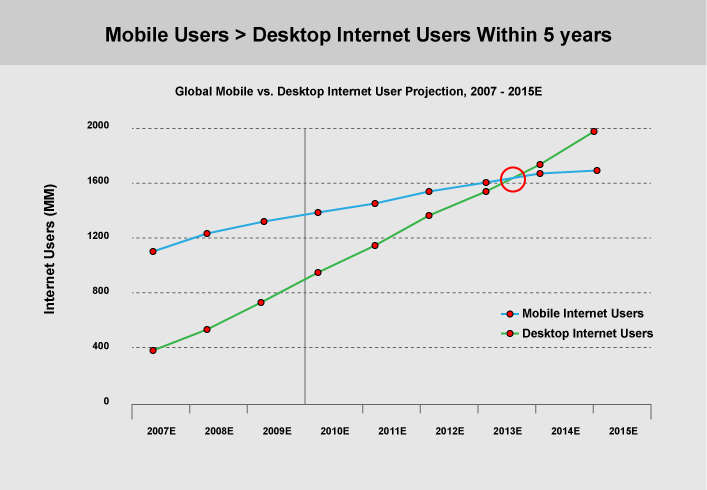
Graph by Morgan Stanley
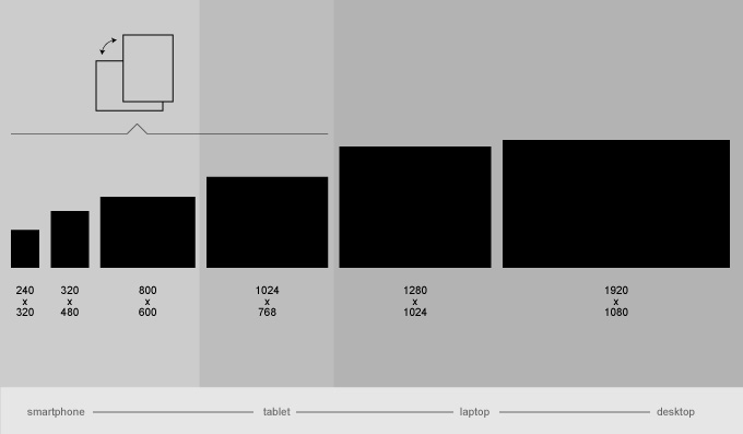
As the available screen space on a smartphone is quite reduced from a typical desktop monitor, the presentation of a website designed for big resolutions (desktop/laptop) is often problematic when viewed on a smartphone or tablet display. Let us not also forget the different navigation paradigm: a touch device has no mouse and uses fingers instead, meaning that small and cluttered links are difficult to use. It is clear that a design and functional approach that works well in a desktop environment may be quite problematic on mobile devices.
Different sites for mobiles: a hornet's nest
One approach to the challenges presented by mobile devices is to implement different versions of the website targetting different devices: one website for desktop, another for iPhones, a third for iPad (see for example, the newspaper Eleftherotipia's two websites for desktop and mobile). What happens when new devices enter the market? Each new device, like the Blackberry, Kindle Fire and many more tablets or small netbooks, comes with new resolutions and capabilities. Even if one were to continue churning out new websites for each device, building ten or twenty different versions, they would be unable to cope with the constant flow of new devices occupying an ever expanding market.
Undoubtedly, creating and maintaining more than one website is a problematic approach. We certainly want to give our website's visitors the best possible experience, suited to the capabilities and limitations of their device of choice. On the other hand, we also need a realistic solution with reasonable support, scaling and expansion costs, ideally supporting not only today's devices, but tomorrow's as well.
The Responsive Design approach
The counter-proposal to developing different sites for different devices is called Responsive Design: a mix of design and development techniques allowing for the creation of a single website able to adapt its contents depending on the size of a device, its resolution and aspect ratio.
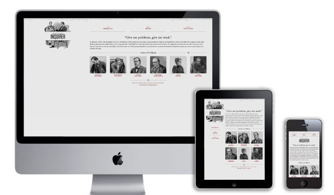
A website built with the responsive design approach adapts its elements depending on the device it is viewed on. For example, a website may present content in a three-column layout in big desktop monitors, become two columns in tablet mode and one column for smartphone displays. Alternatively, the menu elements can grow in size as the screen gets smaller, respecting the inherent inaccuracy of a finger compared to a mouse. Images should be scaled accordingly, and secondary content elements may be removed fully in small devices, bringing to the fron only the content of interest to the viewer.
Take a look at some examples that show the power and adaptability of responsive design. Try opening the following links on different devices, or resize your browser window to see the way the website reacts.
What does it mean to create a Responsive Design website
The methodology of Responsive Design combines cutting-edge technology with a specific design approach and information architecture. Certainly, it is more complex to design a responsive website rather than a desktop-only website, but it is definitely a lot less work than maintaining separate websites per device.
The decision to follow the responsive design approach is a critical decision that must be taken at the beginning of the project - many of the decisions taken in traditional web design are unsuitable for migration into the responsive environment.
It is important to note that Responsive Design is not the ultimate answer to all challenged that the changing world of online communication brings. Still, it is certainly superior to traditional techniques, offering a rich and suitable user experience for the end user, while dramatically reducing the maintenance and expansion costs when new functionalities need to be added to the project.
Get in touch with us to explore what Responsive Design can do for your web presence.